Graphic Design (Packaging)
August. 2018
Kanna—a recreational cannabis brand


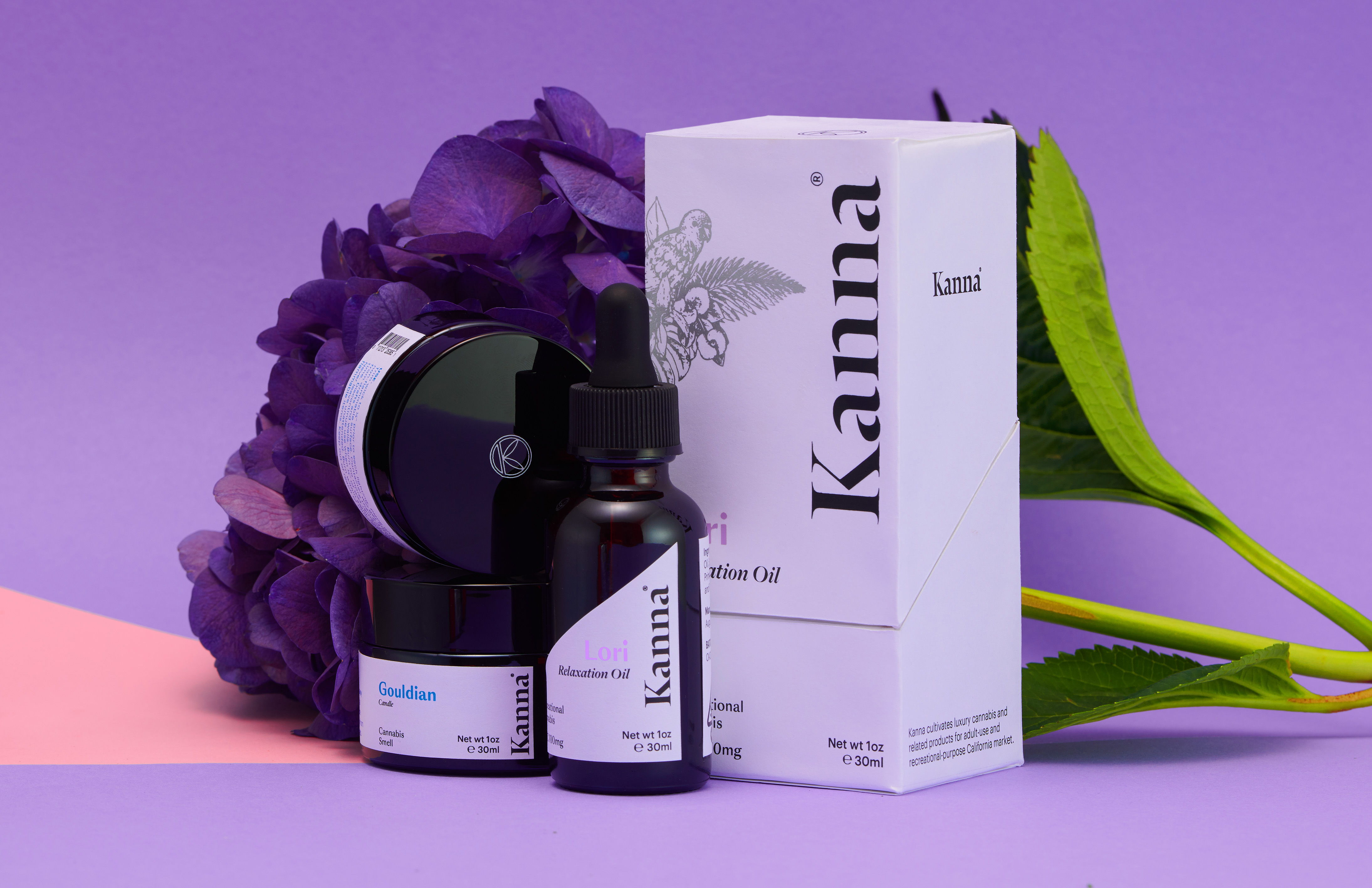
Kanna is a hypothetical line of products targeted for recreational cannabis markets. It intentionally aims to offer customers a luxurious and unique cannabis brand experience.
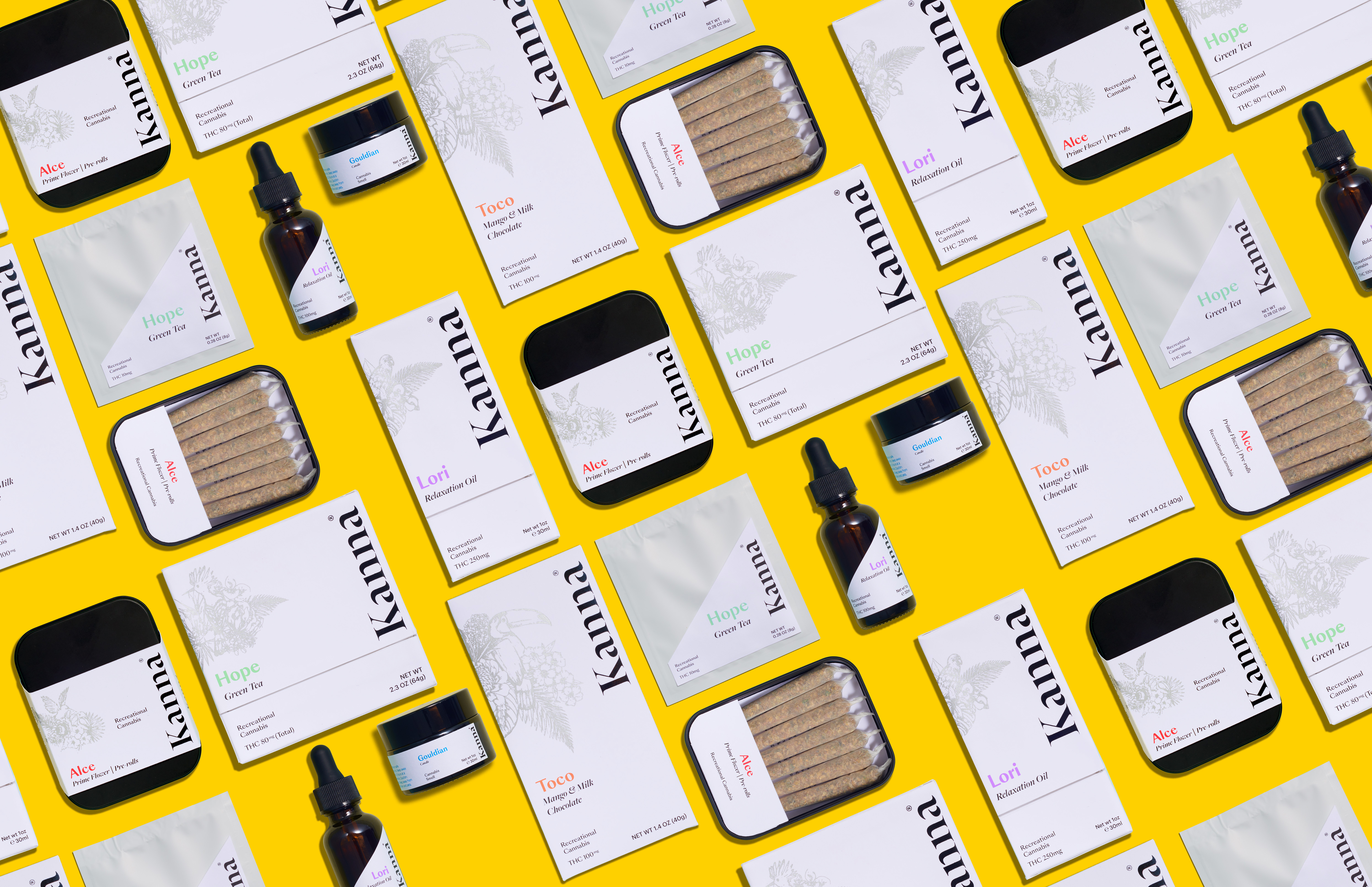
The first challenge in designing this product line, is how to successfully create a premium and aesthetic appearance to audience through visuals under the strict laws of California cannabis packaging. Another main challenge is how to reveal a sense of joy through packaging and label to formally demonstrate the education of cannabis use. The solution is to apply minimal design approaches with appropriate illustrations and vivid colors. Using black & white to simultaneously create a sense of clean, premium quality, and rigor.
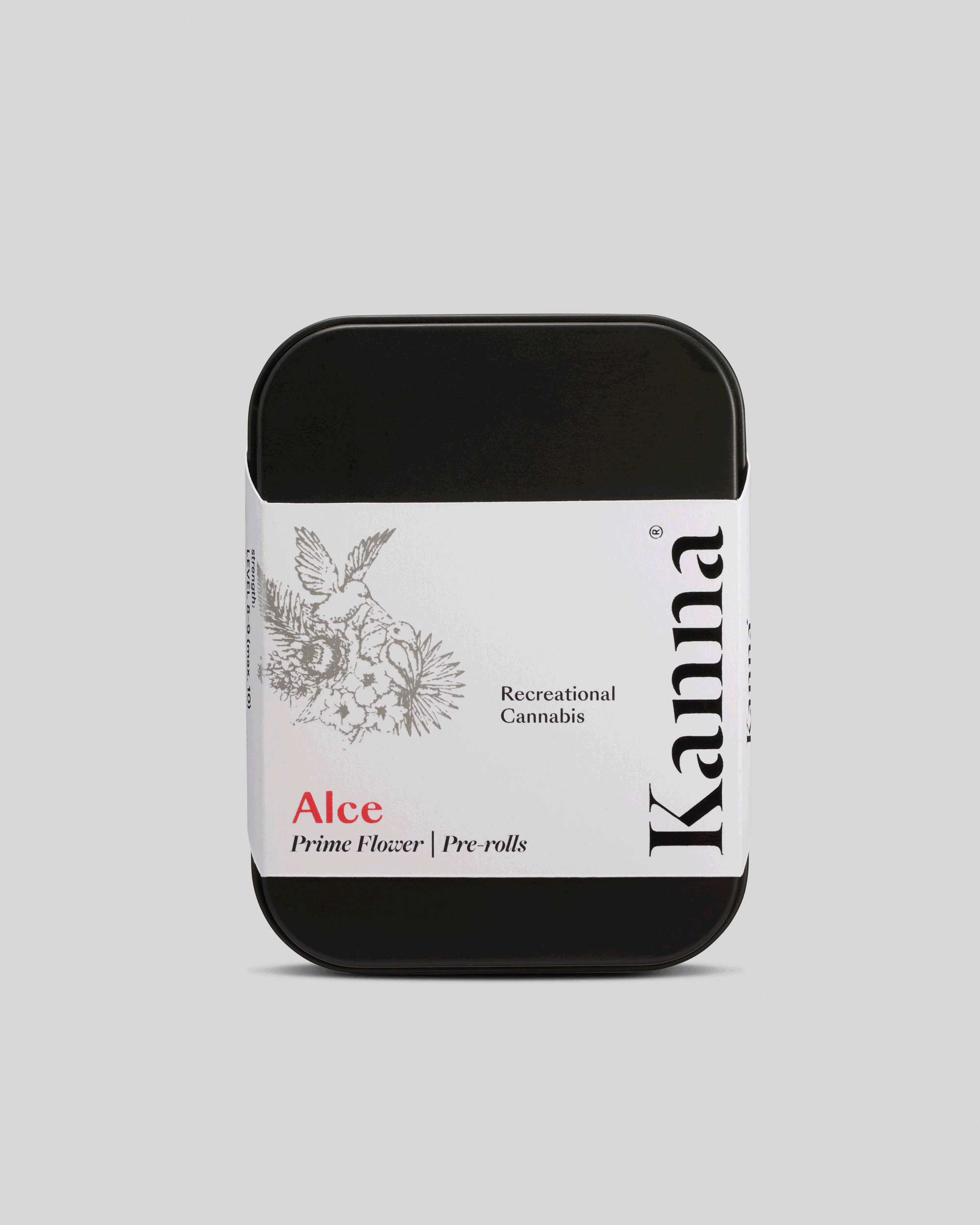
Colors are intentionally used to reveal the strength of the product.
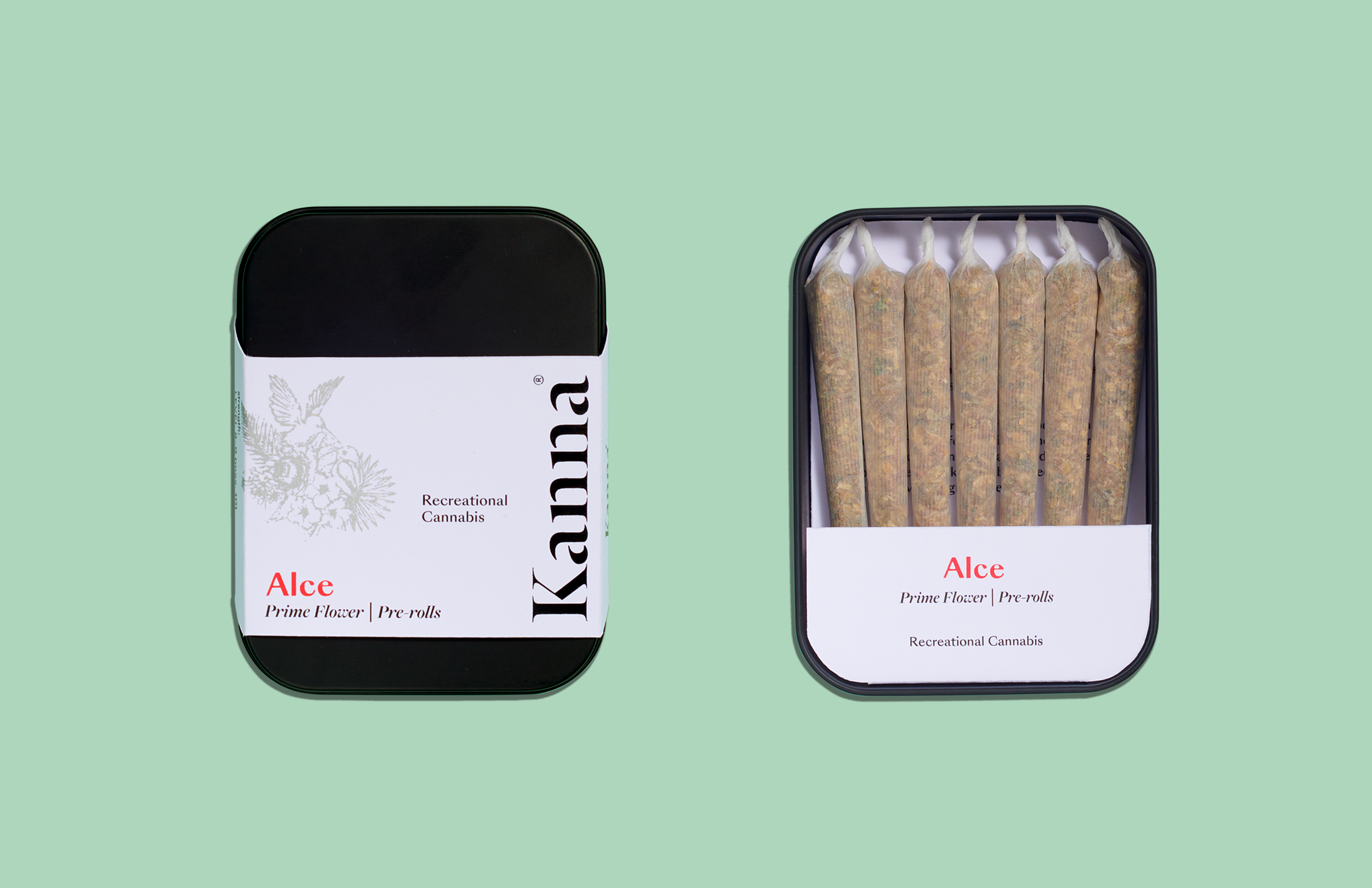
Alce (red): strength level 8–9 (max.10)
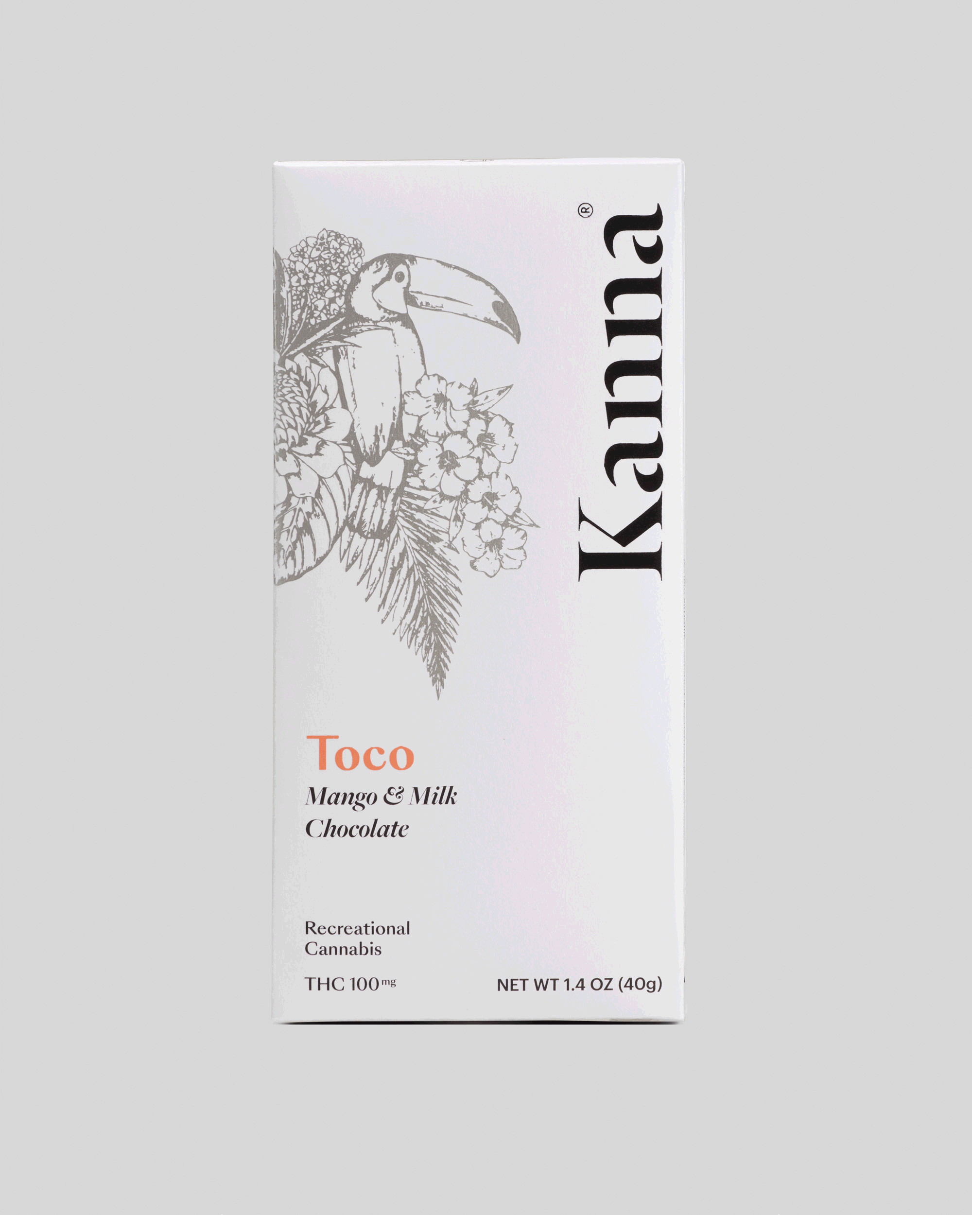
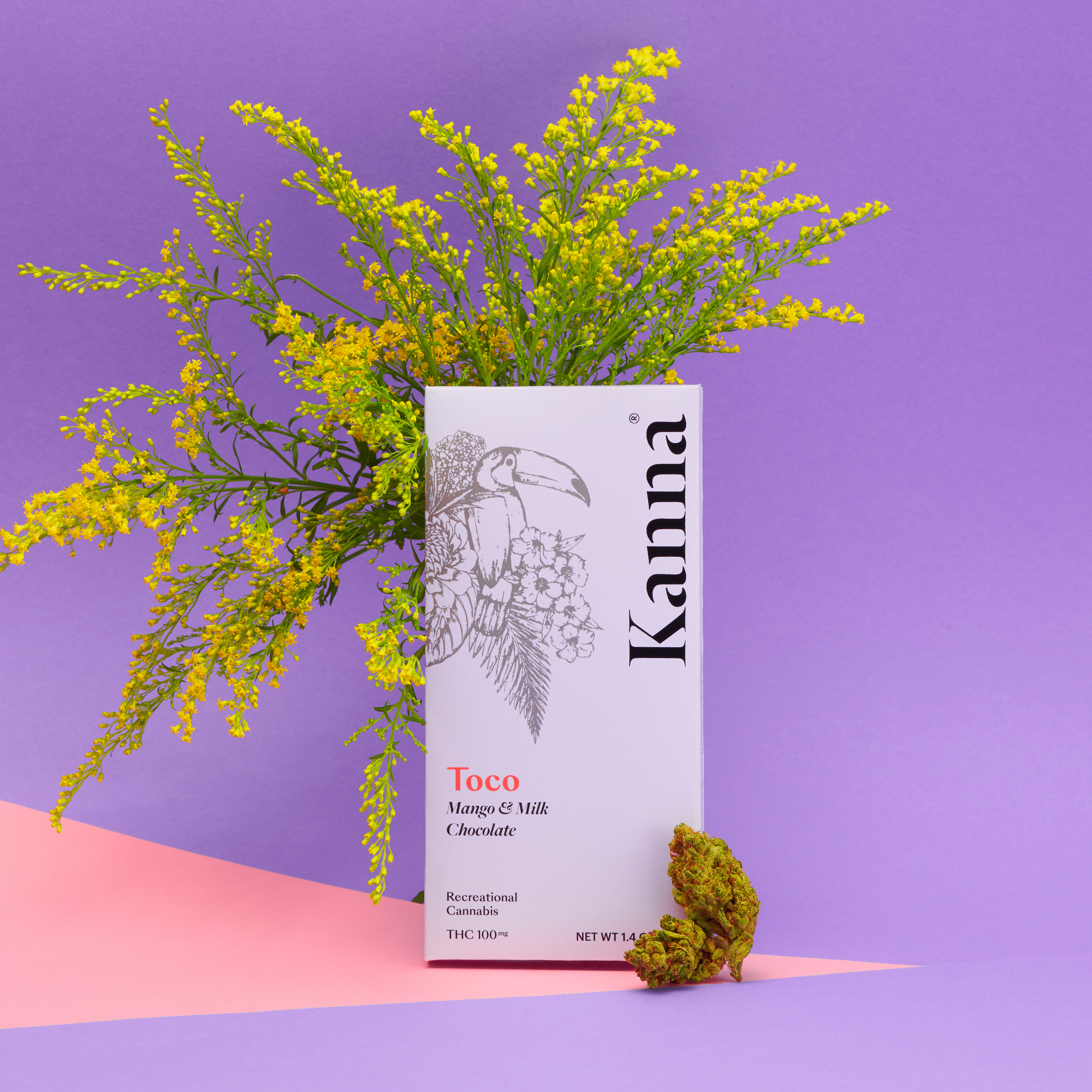
Toco (orange): strength level 7–8 (max.10)
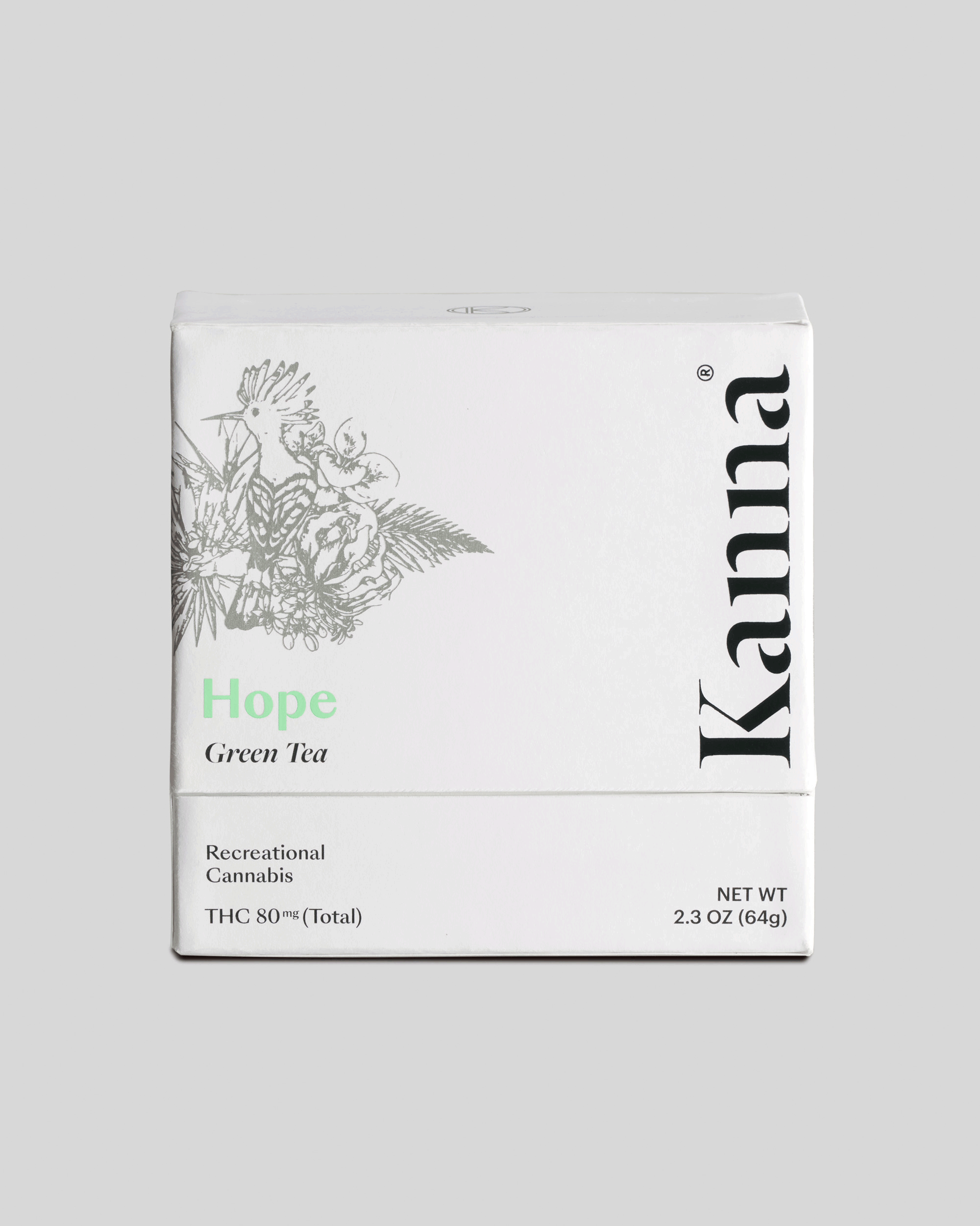
Hope (green): strength level 3–4 (max.10)
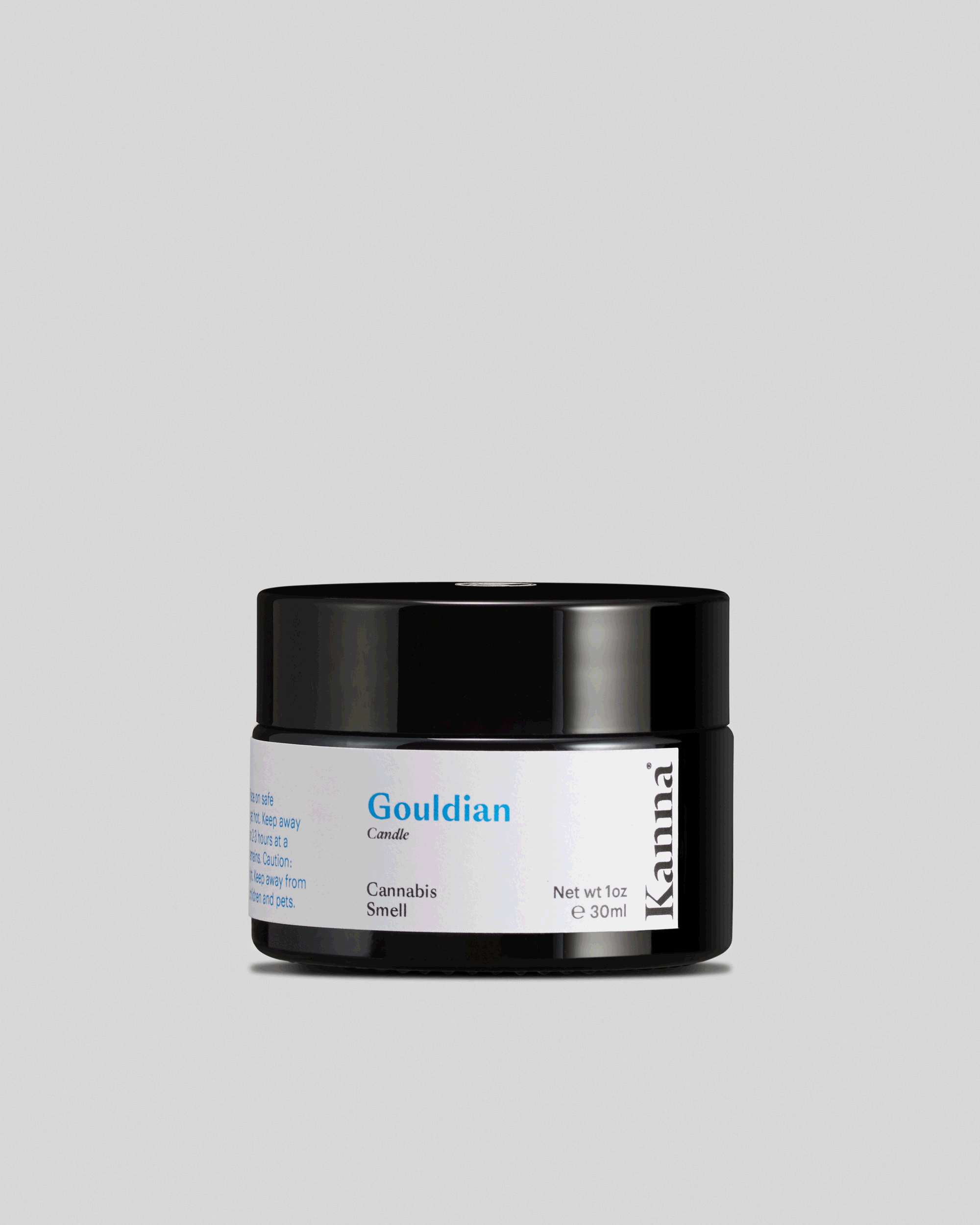
Gouldian (blue): strength level 0 (max.10)
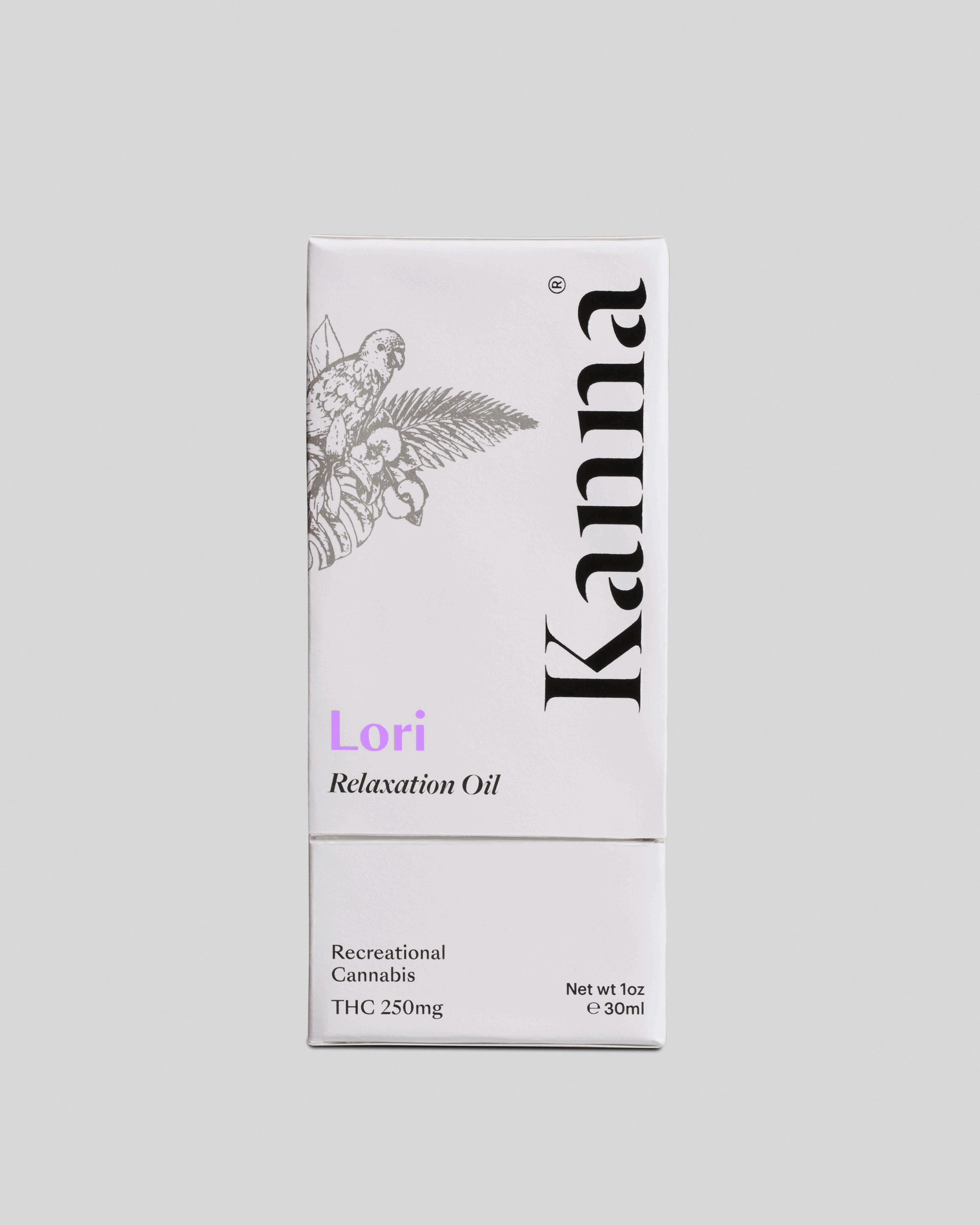
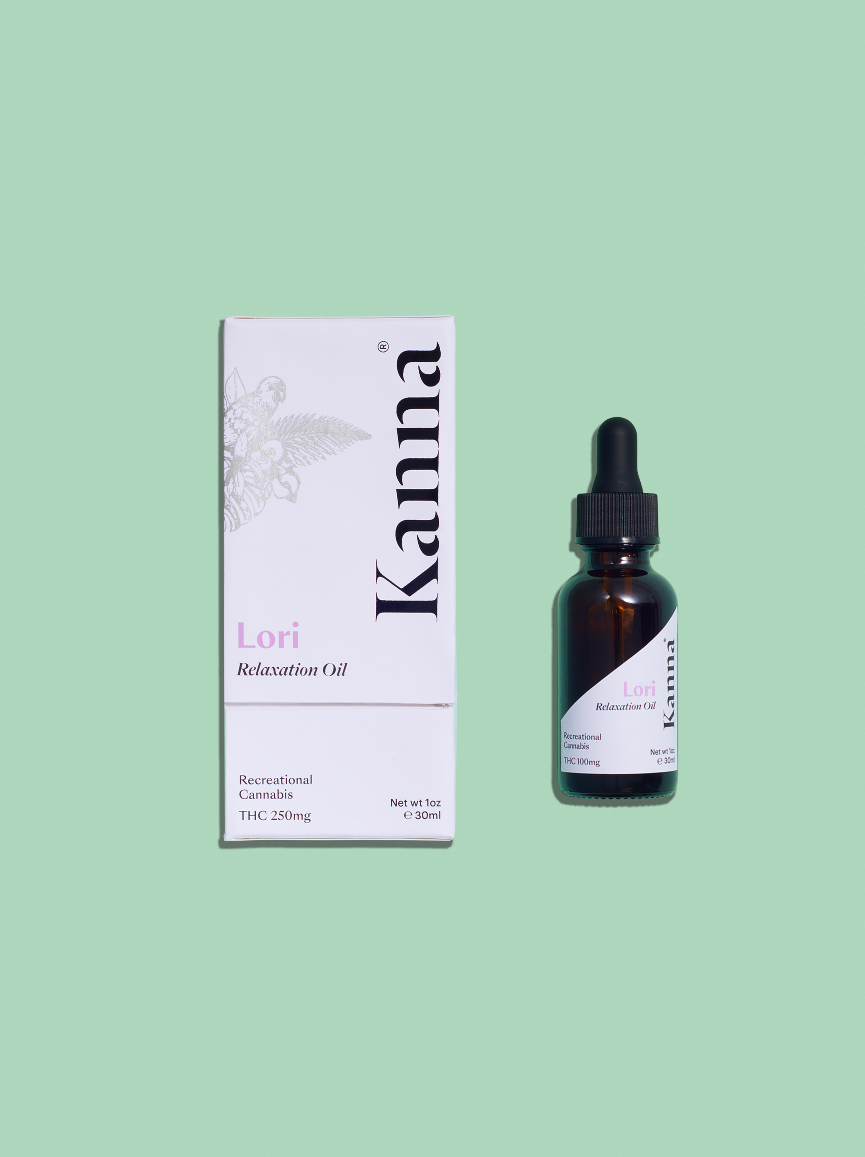
Lori (purple): strength level 1–2 (max.10)
Art Direction: Yi Mao
Design: Yi Mao
Photography: Charlie Sin
Stylist: Charlie Sin & Yi Mao
Instructor: Dan Hoy
*for further information, please visit https://www.behance.net/gallery/70790145/Kannaa-recreational-cannabis-brand
The first challenge in designing this product line, is how to successfully create a premium and aesthetic appearance to audience through visuals under the strict laws of California cannabis packaging. Another main challenge is how to reveal a sense of joy through packaging and label to formally demonstrate the education of cannabis use. The solution is to apply minimal design approaches with appropriate illustrations and vivid colors. Using black & white to simultaneously create a sense of clean, premium quality, and rigor.
Colors are intentionally used to reveal the strength of the product.
Alce (red): strength level 8–9 (max.10)
Toco (orange): strength level 7–8 (max.10)
Hope (green): strength level 3–4 (max.10)
Gouldian (blue): strength level 0 (max.10)
Lori (purple): strength level 1–2 (max.10)
Art Direction: Yi Mao
Design: Yi Mao
Photography: Charlie Sin
Stylist: Charlie Sin & Yi Mao
Instructor: Dan Hoy
*for further information, please visit https://www.behance.net/gallery/70790145/Kannaa-recreational-cannabis-brand