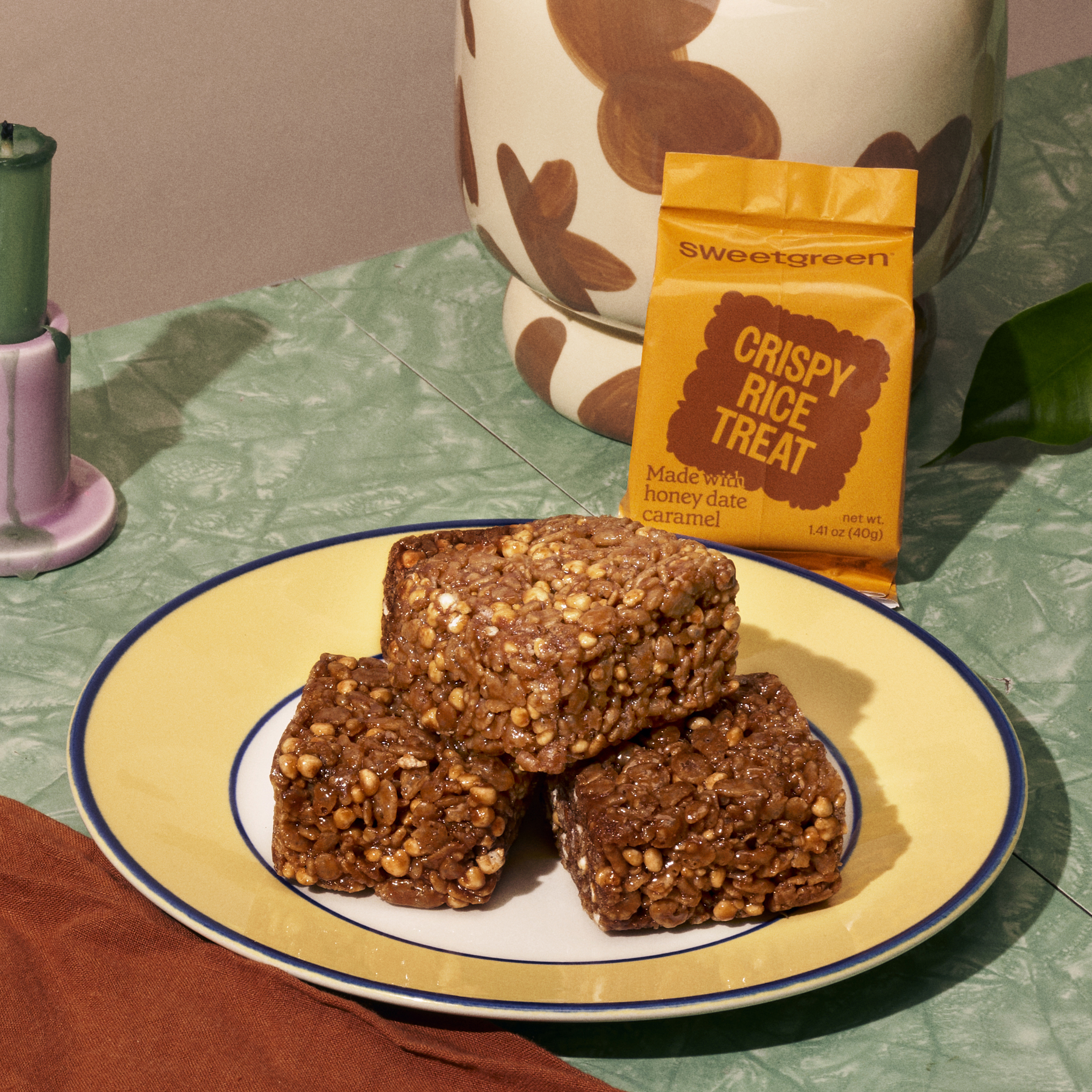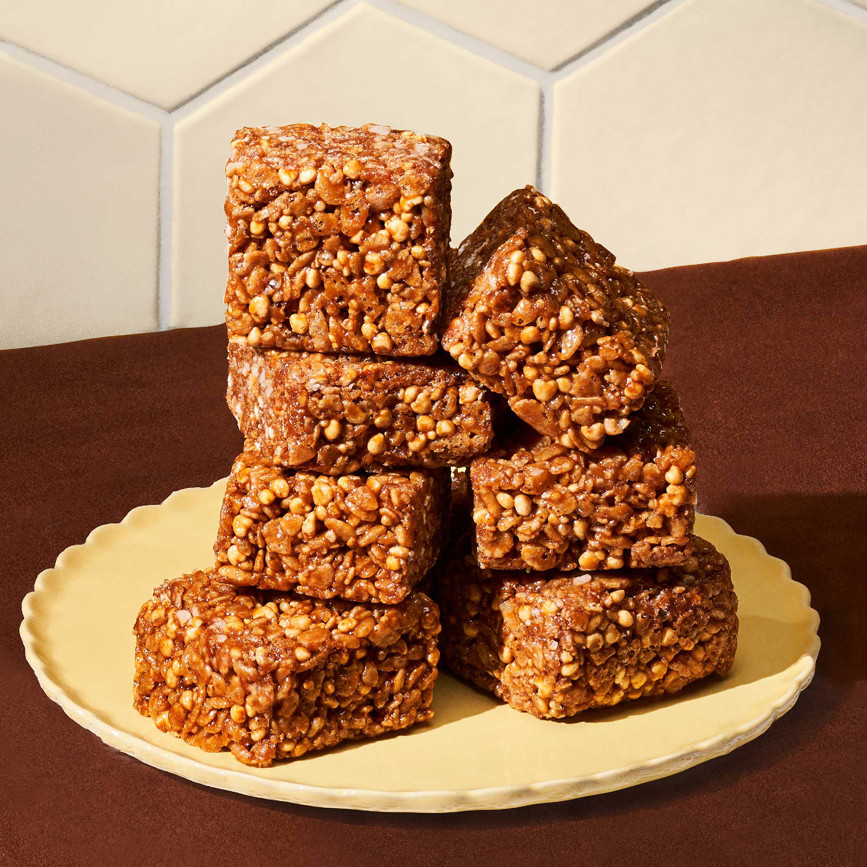
Crispy Rice Treat packaging design
In support of sweetgreen's first item of their dessert category since 2014, I was invited to design the packaging as well as the lettering.
The “sweet treat” is the name of brand’s dessert series. The Crispy Rice Treat is
inaugural product in this category. This dessert is meant to create a healthy yet craveable take on this nostalgic treat. It is made with organic brown rice, quinoa, millet and honey-date caramel. In the future, there is a potential that more items would be invented for sweetgreen’s dessert category.
If you’re also interested in the entire campaign design, feel free to check my coworker Ray’s portfolio.
Year: 2022
sweetgreen team:
Director of Brand: Emily Morris
Creative Director: Brian Okarski
Copywriting: Diane Chang, Alyssa Mandel
Campaign Art Direction: Ray Ramirez
Art Direction Ideation, Packaging Design, Lettering: Yi Mao
Brand Manager: Annie Lee
Intergrated Producer: Erin Fitzpatrick
Photographer: Will Nielsen


The original Rice Krispies Treats were invented in 1939 in the United States by the Kellogg Company. It has been a favorite snack item for kids in the U.S., generation by generation. The Crispy Rice Treat is Sweetgreen’s version invented by celebrity chef Malcolm Livingston II in 2021. This item is meant to be healthier than the original Rice Krispies Treats while maintaining great flavors and textures.


For the lettering design part, the goal is to create an identity of a dessert category that can be ownable for Sweetgreen. I dived deep into the historical references, including type designs, posters, and advertisements from the mid and late 20th Century. Collect and analyze what type designs were related to food and can be nostalgic simultaneously. Those customized letterings with wobbly strokes would solve the challenge. These letters often have exaggerated tear drops with distorted stems. The counter space and lockup of the lettering are intended to look mushy together, mimicking how ingredients are attached. The yellow and brown colors from sweetgreen’s brand colors match some of the ingredients from the dessert.


